Apologies for sending out two posts in one day, but this one is a natural sequel and companion to the post I just sent out, A Tale of Four Supermans. It’s a visual design and illustration style guide I had ChatGPT generate for fun, but the results were interesting enough I might actually load up this style guide in a project folder and use it to generate imagery for this newsletter going forward.
While I have okay visual composition instincts (as in the maps and hand-drawn illustrations I’ve made for decades to accompany my essays), and am tolerably decent at working with real designers and artists in a semi-literate way, actually developing design styles is well beyond me, so it’s interesting that I was able to venture into alien territory and vibe-develop an actually interesting design stylesheet that’s at least good enough for me.
If there’s stuff wrong with this, it’s beyond my discernment, so I’d welcome comments from professional designers.
My original prompt, referencing the chat that generated the Four Supermans article:
I want a visual design style guide for my writing work inspired by the James Gunn style as discussed in our recent chat. But with proportionately more of the guardians of the galaxy energy modifying the Superman energy. And suitable for my nonfiction writing or pragmatic and realistic without naïveté but emotionally positive and accommodating of real world darkness of current zeitgeist. End product should be a color swatch plus guidelines on line work tones, principles for illustrating abstract and representational elements, and opinionated stance on where illustrations should land (literal vs metaphoric, surreal etc, emotional tone etc). Start by suggesting a few directional options. Pretend you’re an art director at a creative agency and im your client.
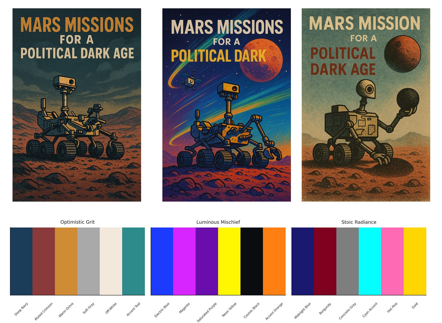
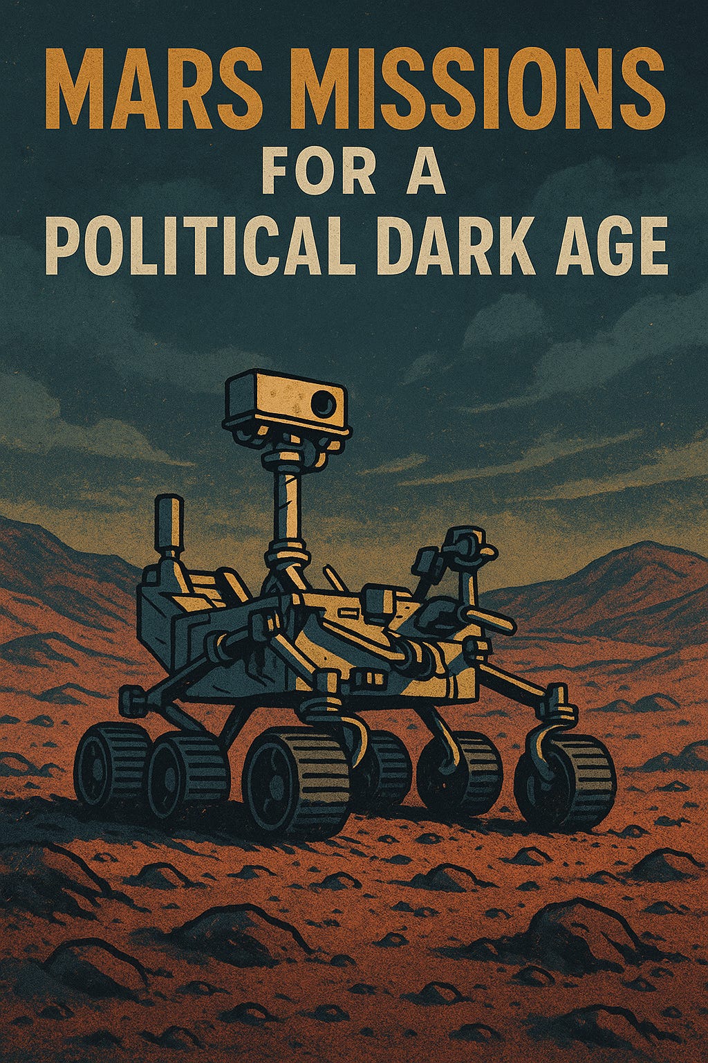
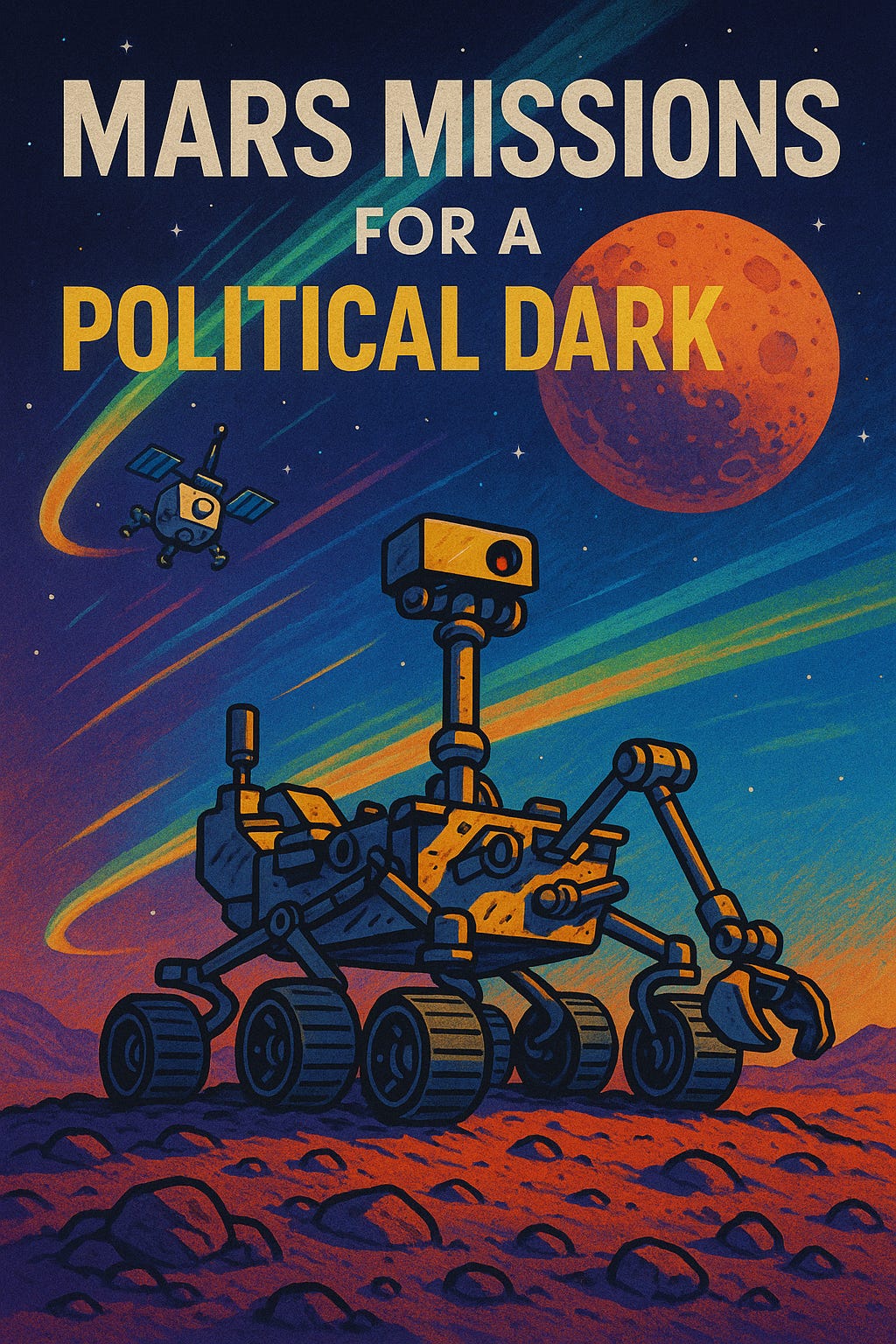
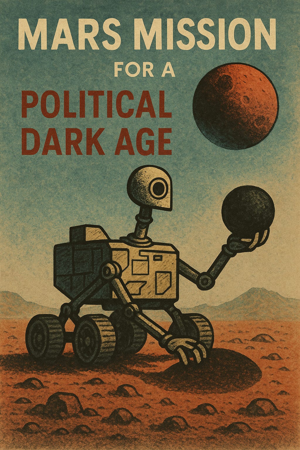
It produced three surprisingly attractive styles in the direction I wanted. I also had it generate comp images along the way for a fake essay titled “Mars Missions for a Political Dark Age” that I might now actually write.
Style Guide
Pragmatic, realistic, emotionally positive, accommodating the present dark zeitgeist. Three complementary directions derived from James Gunn’s Superman palette, tilted toward Guardians of the Galaxy energy.
Sloptraptions is an AI-assisted opt-in section of the Contraptions Newsletter. Recipe at end. If you only want my hand-crafted writing, you can unsubscribe from this section.
1) Optimistic Grit
Palette (hex)
Deep Navy —
#1C3D5AMuted Crimson —
#8B3A3AWarm Ochre —
#D08C34Soft Gray —
#A9A9A9Off-White —
#F2E8DCAccent Teal —
#2E8B8B
Typography Guidelines
Primary (Display): Bold sans-serif with slight texture (e.g., Source Sans Pro Bold; distressed variants acceptable).
Secondary (Body): Humanist serif (e.g., Merriweather).
Tone: Confident, legible, slightly weathered; avoid sterile, glassy finishes.
Illustration Principles
Line work: Strong but imperfect; visible hand pressure or tooth; no clinical vector sheen.
Abstract elements: Geometric but softened—grids, arrows, flows with micro-imperfections.
Representational elements: Stripped-down, almost diagrammatic, but warm.
Interpretation stance: Metaphorical > literal; never surreal. Ground symbols in plausible material reality.
Sample Illustration
Retro-textured editorial poster of a Mars rover in ochre and navy against a grainy twilight sky. Muted primaries with distressed brushwork create a weathered, mid-century space-race vibe. Typography is bold ochre and off-white, set in block sans serif, evoking pragmatic resilience.
2) Luminous Mischief
Palette (hex)
Electric Blue —
#1E3AFFMagenta —
#D726FFSaturated Purple —
#6A0DADNeon Yellow —
#FFF700Cosmic Black —
#0B0C10Accent Orange —
#FF7F11
Typography Guidelines
Primary (Display): Playful rounded sans (e.g., Poppins SemiBold).
Secondary (Body): Clean sans (e.g., Lato Regular).
Tone: Energetic, modern; use pronounced weight/size contrast for momentum.
Illustration Principles
Line work: Curvy, kinetic; motion strokes and asymmetry.
Abstract elements: Surreal bursts and constellations anchored to circuits/maps/star-chart motifs.
Representational elements: Simplified, characterful; functional details remain legible.
Interpretation stance: Half-literal / half-metaphoric; mischievous, never flippant; humor as resilience.
Sample Illustration
Playful neon-cosmic illustration of a Mars rover on saturated red terrain under an electric blue sky with magenta and green auroras. Rover rendered in cartoonish line work with kinetic strokes, accented by glowing yellows. Bold sans serif title floats in high-contrast cosmic palette, fusing whimsy and urgency.
3) Stoic Radiance
Palette (hex)
Midnight Blue —
#191970Burgundy —
#800020Concrete Gray —
#7E7E7ECyan Accent —
#00FFFFHot Pink —
#FF69B4Gold —
#FFD700
Typography Guidelines
Primary (Display): Monumental serif (e.g., Trajan Pro, EB Garamond Bold).
Secondary (Body): Geometric sans (e.g., Montserrat).
Tone: Formal, enduring, authoritative; poster-forward hierarchy.
Illustration Principles
Line work: Clean, architectural; strong geometry with thick–thin contrast.
Abstract elements: Ordered grids and typographic structures.
Representational elements: Heroic, flattened, emblematic; poster-style silhouettes.
Interpretation stance: More literal and symbolic; monumental and stable, with controlled accents of wonder.
Sample Illustration
Poster-style composition of a humanoid rover on Mars, treated in printmaking-inspired textures. Palette is burgundy, midnight blue, and concrete beige with radiant orange accents. Clean geometric line work and monumental typography in cream and brick red convey emblematic endurance and heroic stability.
Recipe
1. Direction Setting
You asked for a visual design style guide inspired by James Gunn’s palette with more Guardians of the Galaxy energy.
I proposed three directions: Optimistic Grit, Luminous Mischief, and Stoic Radiance.
2. Concept → Image Prototyping
I generated textual prompts for all three styles applied to the fake article “Mars Missions for a Political Dark Age.”
You asked to see sample comps → I produced one image per style (rover on Mars).
We established alt-text descriptions for each comp in designer terms.
3. Style Guide Assembly
Built a PDF master style guide with swatches.
Expanded it to include typography guidelines and illustration principles.
Added the alt-text descriptions into the PDF for direct tie-in to sample imagery.
4. Deliverables for Project Folder
Markdown file of the complete stylesheet text (for quick editing and reference).
Swatches image showing all three palettes in labeled blocks.
PDF style guides in multiple versions:
Swatches only
Swatches + Typography + Principles
Final with Alt-text included
5. Working Mode
Protocol was iterative:
Conceptual framing → Textual options
Image generation for visual proof-of-concept
Formalizing into structured artifacts (PDF, MD, PNG)
You directed next steps at each stage; I avoided speculative suggestions.
Each artifact was packaged for direct download so you can drop them into a project folder.


V2, “A Political Dark” is maybe more interesting a phrase than classic Dark Age